网页
综合
更新时间 2021-05-12 20:05:00
A Complete Guide to CSS Grid Layout | CSS-Tricks
Our comprehensive guide to CSS Grid layout, focusing on all the settings both for the grid parent container and the grid child elements with examples and tutorials.
CSS Grid Layout (aka “Grid” or “CSS Grid”), is a two-dimensional grid-based layout system that, compared to any web layout system of the past, completely changes the way we design user interfaces. CSS has always been used to layout our web pages, but it’s never done a very good job of it. First, we used tables, then floats, positioning and inline-block, but all of these methods were essentially hacks and left out a lot of important functionality (vertical centering, for instance).
CSS Flexbox is also a very great layout tool, but its one-directional flow has different use cases — and they actually work together quite well! CSS Grid is the very first CSS module created specifically to solve the layout problems we’ve all been hacking our way around for as long as we’ve been making websites.
The intention of this guide is to present CSS Grid concepts as they exist in the latest version of the specification. So, we will not cover the out-of-date Internet Explorer syntax or other historical hacks.
Before diving into the concepts of CSS Grid, it’s important to understand the terminology. Since the terms involved here are all kinda conceptually similar, it’s easy to confuse them with one another if you don’t first memorize their meanings defined by the CSS Grid specification. But don’t worry, there aren’t many of them.
The element on which display: grid is applied. It’s the direct parent of all the grid items. In this example container is the grid container.
The children (i.e. direct descendants) of the grid container. Here the item elements are grid items, but sub-item isn’t.
The dividing lines that make up the structure of the grid. They can be either vertical (“column grid lines”) or horizontal (“row grid lines”) and reside on either side of a row or column. Here the yellow line is an example of a column grid line.
The space between two adjacent grid lines. You can think of them as the columns or rows of the grid. Here’s the grid track between the second and third-row grid lines.
The total space surrounded by four grid lines. A grid area may be composed of any number of grid cells. Here’s the grid area between row grid lines 1 and 3, and column grid lines 1 and 3.
The space between two adjacent row and two adjacent column grid lines. It’s a single “unit” of the grid. Here’s the grid cell between row grid lines 1 and 2, and column grid lines 2 and 3.
Defines the element as a grid container and establishes a new grid formatting context for its contents.
The ability to pass grid parameters down through nested elements (aka subgrids) has been moved to CSS Grid Specification Level 2. Here’s a quick explanation.
Defines the columns and rows of the grid with a space-separated list of values. The values represent the track size, and the space between them represents the grid line.
Grid lines are automatically assigned positive numbers from these assignments (-1 being an alternate for the very last row).
But you can choose to explicitly name the lines. Note the bracket syntax for the line names:
Note that a line can have more than one name. For example, here the second line will have two names: row1-end and row2-start:
If your definition contains repeating parts, you can use the repeat() notation to streamline things:
Which is equivalent to this:
If multiple lines share the same name, they can be referenced by their line name and count.
The fr unit allows you to set the size of a track as a fraction of the free space of the grid container. For example, this will set each item to one third the width of the grid container:
The free space is calculated after any non-flexible items. In this example the total amount of free space available to the fr units doesn’t include the 50px:
A shorthand for setting grid-template-rows, grid-template-columns, and grid-template-areas in a single declaration.
It also accepts a more complex but quite handy syntax for specifying all three. Here’s an example:
That’s equivalent to this:
Since grid-template doesn’t reset the implicit grid properties (grid-auto-columns, grid-auto-rows, and grid-auto-flow), which is probably what you want to do in most cases, it’s recommended to use the grid property instead of grid-template.
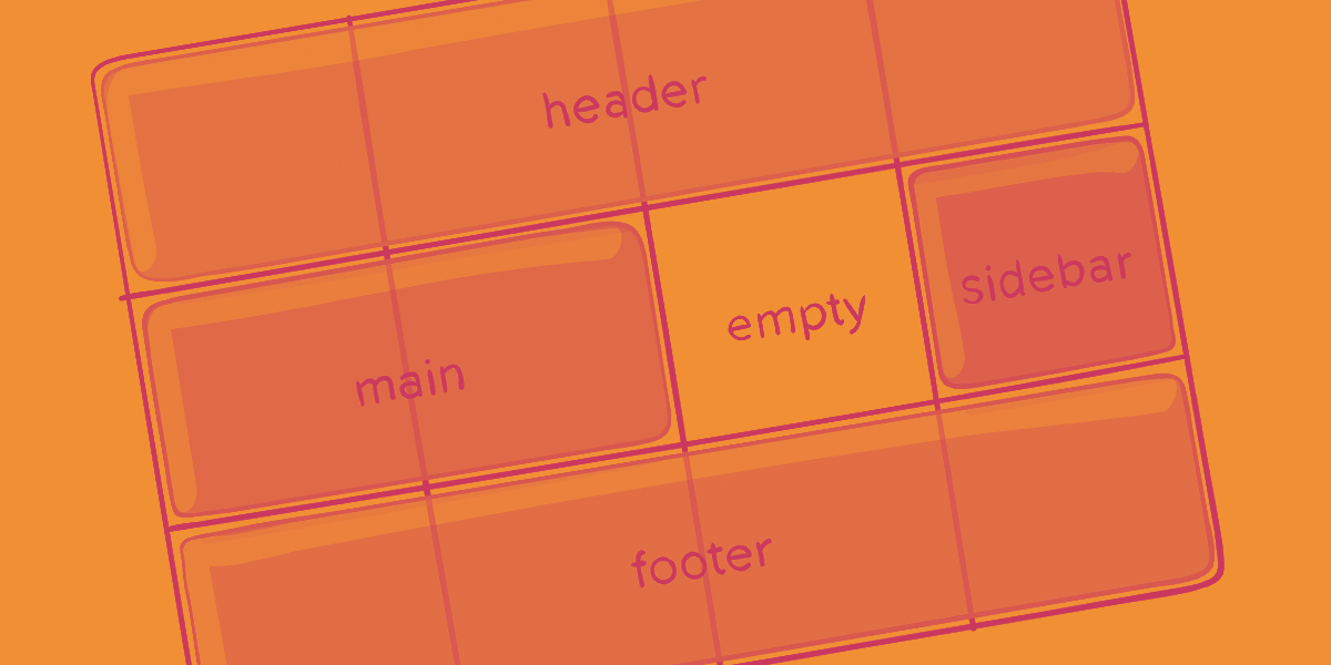
Defines a grid template by referencing the names of the grid areas which are specified with the grid-area property. Repeating the name of a grid area causes the content to span those cells. A period signifies an empty cell. The syntax itself provides a visualization of the structure of the grid.
That’ll create a grid that’s four columns wide by three rows tall. The entire top row will be composed of the header area. The middle row will be composed of two main areas, one empty cell, and one sidebar area. The last row is all footer.
Each row in your declaration needs to have the same number of cells.
You can use any number of adjacent periods to declare a single empty cell. As long as the periods have no spaces between them they represent a single cell.
Notice that you’re not naming lines with this syntax, just areas. When you use this syntax the lines on either end of the areas are actually getting named automatically. If the name of your grid area is foo, the name of the area’s starting row line and starting column line will be foo-start, and the name of its last row line and last column line will be foo-end. This means that some lines might have multiple names, such as the far left line in the above example, which will have three names: header-start, main-start, and footer-start.
A shorthand for setting all of the following properties in a single declaration: grid-template-rows, grid-template-columns, grid-template-areas, grid-auto-rows, grid-auto-columns, and grid-auto-flow
You can only specify the explicit or the implicit grid properties in a single grid declaration.
The following two code
CSS Grid Layout (aka “Grid” or “CSS Grid”), is a two-dimensional grid-based layout system that, compared to any web layout system of the past, completely changes the way we design user interfaces. CSS has always been used to layout our web pages, but it’s never done a very good job of it. First, we used tables, then floats, positioning and inline-block, but all of these methods were essentially hacks and left out a lot of important functionality (vertical centering, for instance).
CSS Flexbox is also a very great layout tool, but its one-directional flow has different use cases — and they actually work together quite well! CSS Grid is the very first CSS module created specifically to solve the layout problems we’ve all been hacking our way around for as long as we’ve been making websites.
The intention of this guide is to present CSS Grid concepts as they exist in the latest version of the specification. So, we will not cover the out-of-date Internet Explorer syntax or other historical hacks.
Before diving into the concepts of CSS Grid, it’s important to understand the terminology. Since the terms involved here are all kinda conceptually similar, it’s easy to confuse them with one another if you don’t first memorize their meanings defined by the CSS Grid specification. But don’t worry, there aren’t many of them.
The element on which display: grid is applied. It’s the direct parent of all the grid items. In this example container is the grid container.
The children (i.e. direct descendants) of the grid container. Here the item elements are grid items, but sub-item isn’t.
The dividing lines that make up the structure of the grid. They can be either vertical (“column grid lines”) or horizontal (“row grid lines”) and reside on either side of a row or column. Here the yellow line is an example of a column grid line.
The space between two adjacent grid lines. You can think of them as the columns or rows of the grid. Here’s the grid track between the second and third-row grid lines.
The total space surrounded by four grid lines. A grid area may be composed of any number of grid cells. Here’s the grid area between row grid lines 1 and 3, and column grid lines 1 and 3.
The space between two adjacent row and two adjacent column grid lines. It’s a single “unit” of the grid. Here’s the grid cell between row grid lines 1 and 2, and column grid lines 2 and 3.
Defines the element as a grid container and establishes a new grid formatting context for its contents.
The ability to pass grid parameters down through nested elements (aka subgrids) has been moved to CSS Grid Specification Level 2. Here’s a quick explanation.
Defines the columns and rows of the grid with a space-separated list of values. The values represent the track size, and the space between them represents the grid line.
Grid lines are automatically assigned positive numbers from these assignments (-1 being an alternate for the very last row).
But you can choose to explicitly name the lines. Note the bracket syntax for the line names:
Note that a line can have more than one name. For example, here the second line will have two names: row1-end and row2-start:
If your definition contains repeating parts, you can use the repeat() notation to streamline things:
Which is equivalent to this:
If multiple lines share the same name, they can be referenced by their line name and count.
The fr unit allows you to set the size of a track as a fraction of the free space of the grid container. For example, this will set each item to one third the width of the grid container:
The free space is calculated after any non-flexible items. In this example the total amount of free space available to the fr units doesn’t include the 50px:
A shorthand for setting grid-template-rows, grid-template-columns, and grid-template-areas in a single declaration.
It also accepts a more complex but quite handy syntax for specifying all three. Here’s an example:
That’s equivalent to this:
Since grid-template doesn’t reset the implicit grid properties (grid-auto-columns, grid-auto-rows, and grid-auto-flow), which is probably what you want to do in most cases, it’s recommended to use the grid property instead of grid-template.
Defines a grid template by referencing the names of the grid areas which are specified with the grid-area property. Repeating the name of a grid area causes the content to span those cells. A period signifies an empty cell. The syntax itself provides a visualization of the structure of the grid.
That’ll create a grid that’s four columns wide by three rows tall. The entire top row will be composed of the header area. The middle row will be composed of two main areas, one empty cell, and one sidebar area. The last row is all footer.
Each row in your declaration needs to have the same number of cells.
You can use any number of adjacent periods to declare a single empty cell. As long as the periods have no spaces between them they represent a single cell.
Notice that you’re not naming lines with this syntax, just areas. When you use this syntax the lines on either end of the areas are actually getting named automatically. If the name of your grid area is foo, the name of the area’s starting row line and starting column line will be foo-start, and the name of its last row line and last column line will be foo-end. This means that some lines might have multiple names, such as the far left line in the above example, which will have three names: header-start, main-start, and footer-start.
A shorthand for setting all of the following properties in a single declaration: grid-template-rows, grid-template-columns, grid-template-areas, grid-auto-rows, grid-auto-columns, and grid-auto-flow
You can only specify the explicit or the implicit grid properties in a single grid declaration.
The following two code
本页为82搜索生成的网页快照,内容来自站内索引;演示数据的原文链接仅作示例。