网页
综合
更新时间 2026-05-28 15:17:48
A Complete Guide to CSS Flexbox | CSS-Tricks
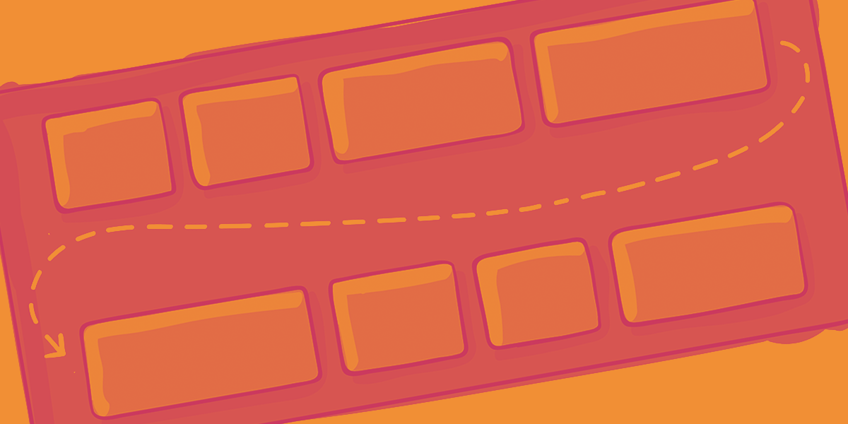
Our comprehensive guide to CSS flexbox layout. This complete guide explains everything about flexbox, focusing on all the different possible properties for the parent element (the flex container) and the child elements (the flex items). It also includes history, demos, patterns, and a browser support chart.
Advertise your product or service right here with the best front-end community on earth.
The Flexbox Layout (Flexible Box) module provides a more efficient way to lay out, align and distribute space among items in a container, even when their size is unknown and/or dynamic (thus the word “flex”).
The main idea behind the flex layout is to give the container the ability to alter its items’ width/height (and order) to best fill the available space (mostly to accommodate to all kind of display devices and screen sizes). A flex container expands items to fill available free space or shrinks them to prevent overflow.
Most importantly, the flexbox layout is direction-agnostic as opposed to the regular layouts (block which is vertically-based and inline which is horizontally-based). While those work well for pages, they lack flexibility (no pun intended) to support large or complex applications (especially when it comes to orientation changing, resizing, stretching, shrinking, etc.).
Note: Flexbox layout is most appropriate to the components of an application, and small-scale layouts, while the CSS Grid layout is intended for larger scale layouts.
Since flexbox is a whole module and not a single property, it involves a lot of things including its whole set of properties. Some of them are meant to be set on the container (parent element, known as “flex container”) whereas the others are meant to be set on the children (said “flex items”).
If “regular” layout is based on both block and inline flow directions, the flex layout is based on “flex-flow directions”. Please have a look at this figure from the specification, explaining the main idea behind the flex layout.
Items will be laid out following either the main axis (from main-start to main-end) or the cross axis (from cross-start to cross-end).
This defines a flex container; inline or block depending on the given value. It enables a flex context for all its direct children.
Note that CSS columns have no effect on a flex container.
This establishes the main-axis, thus defining the direction flex items are placed in the flex container. Flexbox is (aside from optional wrapping) a single-direction layout concept. Think of flex items as primarily laying out either in horizontal rows or vertical columns.
By default, flex items will all try to fit onto one line. You can change that and allow the items to wrap as needed with this property.
There are some visual demos of flex-wrap here.
This is a shorthand for the flex-direction and flex-wrap properties, which together define the flex container’s main and cross axes. The default value is row nowrap.
This defines the alignment along the main axis. It helps distribute extra free space leftover when either all the flex items on a line are inflexible, or are flexible but have reached their maximum size. It also exerts some control over the alignment of items when they overflow the line.
Note that that browser support for these values is nuanced. For example, space-between never got support from some versions of Edge, and start/end/left/right aren’t in Chrome yet. MDN has detailed charts. The safest values are flex-start, flex-end, and center.
There are also two additional keywords you can pair with these values: safe and unsafe. Using safe ensures that however you do this type of positioning, you can’t push an element such that it renders off-screen (e.g. off the top) in such a way the content can’t be scrolled too (called “data loss”).
This defines the default behavior for how flex items are laid out along the cross axis on the current line. Think of it as the justify-content version for the cross-axis (perpendicular to the main-axis).
The safe and unsafe modifier keywords can be used in conjunction with all the rest of these keywords (although note browser support), and deal with helping you prevent aligning elements such that the content becomes inaccessible.
This aligns a flex container’s lines within when there is extra space in the cross-axis, similar to how justify-content aligns individual items within the main-axis.
Note: This property only takes effect on multi-line flexible containers, where flex-wrap is set to either wrap or wrap-reverse). A single-line flexible container (i.e. where flex-wrap is set to its default value, no-wrap) will not reflect align-content.
The safe and unsafe modifier keywords can be used in conjunction with all the rest of these keywords and deal with helping you prevent aligning elements such that the content becomes inaccessible.
The gap property explicitly controls the space between flex items. It applies that spacing only between items not on the outer edges.
The behavior could be thought of as a minimum gutter, as if the gutter is bigger somehow (because of something like justify-content: space-between;) then the gap will only take effect if that space would end up smaller.
It is not exclusively for flexbox, gap works in grid and multi-column layout as well.
The place-items property in CSS is shorthand for the align-items and justify-items properties, combining them into a single declaration. The property accepts dual values, the first for align-items and the second for justify-items. Or a single value to apply the same value to both.
By default, flex items are laid out in the source order. However, the order property controls the order in which they appear in the flex container.
Items with the same order revert to source order.
This defines the ability for a flex item to grow if necessary. It accepts a unitless value that serves as a proportion. It dictates what amount of the available space inside the flex container the item should take up.
If all items have fl
Advertise your product or service right here with the best front-end community on earth.
The Flexbox Layout (Flexible Box) module provides a more efficient way to lay out, align and distribute space among items in a container, even when their size is unknown and/or dynamic (thus the word “flex”).
The main idea behind the flex layout is to give the container the ability to alter its items’ width/height (and order) to best fill the available space (mostly to accommodate to all kind of display devices and screen sizes). A flex container expands items to fill available free space or shrinks them to prevent overflow.
Most importantly, the flexbox layout is direction-agnostic as opposed to the regular layouts (block which is vertically-based and inline which is horizontally-based). While those work well for pages, they lack flexibility (no pun intended) to support large or complex applications (especially when it comes to orientation changing, resizing, stretching, shrinking, etc.).
Note: Flexbox layout is most appropriate to the components of an application, and small-scale layouts, while the CSS Grid layout is intended for larger scale layouts.
Since flexbox is a whole module and not a single property, it involves a lot of things including its whole set of properties. Some of them are meant to be set on the container (parent element, known as “flex container”) whereas the others are meant to be set on the children (said “flex items”).
If “regular” layout is based on both block and inline flow directions, the flex layout is based on “flex-flow directions”. Please have a look at this figure from the specification, explaining the main idea behind the flex layout.
Items will be laid out following either the main axis (from main-start to main-end) or the cross axis (from cross-start to cross-end).
This defines a flex container; inline or block depending on the given value. It enables a flex context for all its direct children.
Note that CSS columns have no effect on a flex container.
This establishes the main-axis, thus defining the direction flex items are placed in the flex container. Flexbox is (aside from optional wrapping) a single-direction layout concept. Think of flex items as primarily laying out either in horizontal rows or vertical columns.
By default, flex items will all try to fit onto one line. You can change that and allow the items to wrap as needed with this property.
There are some visual demos of flex-wrap here.
This is a shorthand for the flex-direction and flex-wrap properties, which together define the flex container’s main and cross axes. The default value is row nowrap.
This defines the alignment along the main axis. It helps distribute extra free space leftover when either all the flex items on a line are inflexible, or are flexible but have reached their maximum size. It also exerts some control over the alignment of items when they overflow the line.
Note that that browser support for these values is nuanced. For example, space-between never got support from some versions of Edge, and start/end/left/right aren’t in Chrome yet. MDN has detailed charts. The safest values are flex-start, flex-end, and center.
There are also two additional keywords you can pair with these values: safe and unsafe. Using safe ensures that however you do this type of positioning, you can’t push an element such that it renders off-screen (e.g. off the top) in such a way the content can’t be scrolled too (called “data loss”).
This defines the default behavior for how flex items are laid out along the cross axis on the current line. Think of it as the justify-content version for the cross-axis (perpendicular to the main-axis).
The safe and unsafe modifier keywords can be used in conjunction with all the rest of these keywords (although note browser support), and deal with helping you prevent aligning elements such that the content becomes inaccessible.
This aligns a flex container’s lines within when there is extra space in the cross-axis, similar to how justify-content aligns individual items within the main-axis.
Note: This property only takes effect on multi-line flexible containers, where flex-wrap is set to either wrap or wrap-reverse). A single-line flexible container (i.e. where flex-wrap is set to its default value, no-wrap) will not reflect align-content.
The safe and unsafe modifier keywords can be used in conjunction with all the rest of these keywords and deal with helping you prevent aligning elements such that the content becomes inaccessible.
The gap property explicitly controls the space between flex items. It applies that spacing only between items not on the outer edges.
The behavior could be thought of as a minimum gutter, as if the gutter is bigger somehow (because of something like justify-content: space-between;) then the gap will only take effect if that space would end up smaller.
It is not exclusively for flexbox, gap works in grid and multi-column layout as well.
The place-items property in CSS is shorthand for the align-items and justify-items properties, combining them into a single declaration. The property accepts dual values, the first for align-items and the second for justify-items. Or a single value to apply the same value to both.
By default, flex items are laid out in the source order. However, the order property controls the order in which they appear in the flex container.
Items with the same order revert to source order.
This defines the ability for a flex item to grow if necessary. It accepts a unitless value that serves as a proportion. It dictates what amount of the available space inside the flex container the item should take up.
If all items have fl
本页为82搜索生成的网页快照,内容来自站内索引;演示数据的原文链接仅作示例。