网页
综合
更新时间 2025-05-05 13:01:43
Modern Scroll Shadows Using Scroll-Driven Animations | CSS-Tricks
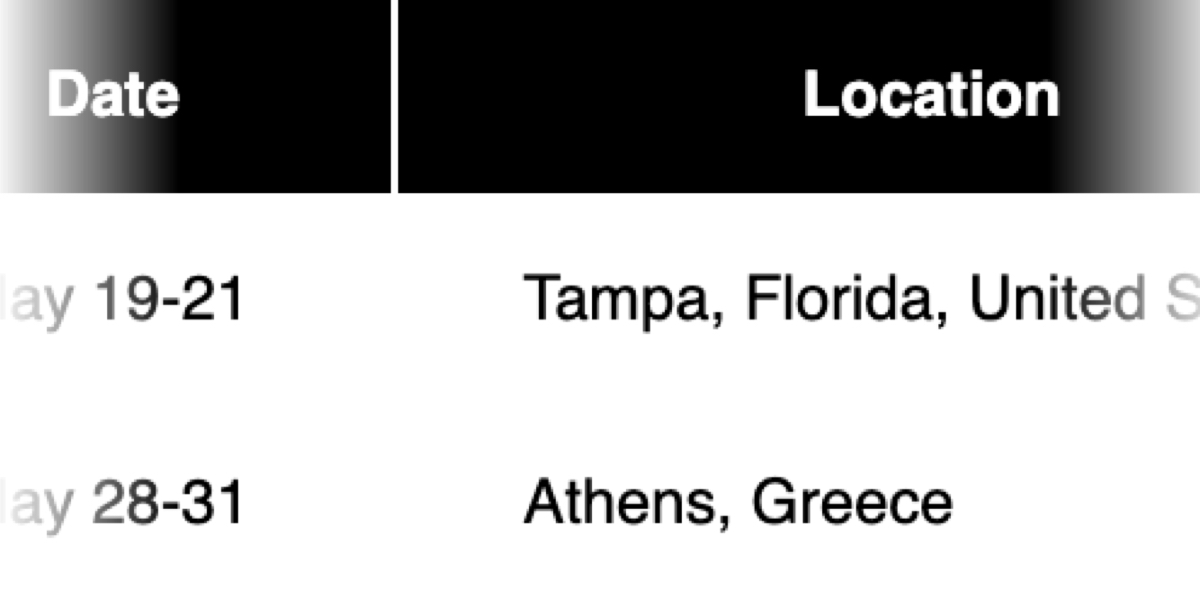
Using scroll shadows, especially for mobile devices, is a subtle bit of UX that Chris has covered before (indeed, it’s one of his all-time favorite CSS tricks), by layering background gradients with different attachments, we can get shadows that are covered up when you’ve scrolled to the limits of the element.
Geoff covered a newer approach that uses the animation-timeline property. Using animation-timeline, we can tie CSS animation to the scroll position. His example uses pseudo-elements to render the scroll shadows, and animation-range to animate the opacity of the pseudo-elements based on scroll.
Here’s yet another way. Instead of using shadows, let’s use a CSS mask to fade out the edges of the scrollable element. This is a slightly different visual metaphor that works great for horizontally scrollable elements — places where your scrollable element doesn’t have a distinct border of its own. This approach still uses animation-timeline, but we’ll use custom properties instead of pseudo-elements. Since we’re fading, the effect also works regardless of whether we’re on a dark or light background.
First, we’ll define our scrollable element with a mask that fades out the start and end of the container. For this example, let’s consider the infamous table that can’t be responsive and has to be horizontally scrollable on mobile.
Let’s add the mask. We can use the shorthand and find the mask as a linear gradient that fades out on either end. A mask lets the table fade into the background instead of overlaying a shadow, but you could use the same technique for shadows.
Next, we need to define our custom properties and the animation. We’ll define two separate properties, --left-fade and --right-fade, using @property. Using @property is necessary here to specify the syntax of the properties so that browsers can animate the property’s values.
Instead of using multiple animations or animation-range, we can define a single animation where --left-fade animates from 0 to 3rem between 0-10%, and --right-fade animates from 3rem to 0 between 90-100%. Now we update our mask to use our custom properties and tie the scroll-timeline of our element to its own animation-timeline.
Putting it all together, we have the effect we’re after:
We’re still waiting for some browsers (Safari) to support animation-timeline, but this gracefully degrades to simply not fading the element at all.
I like this implementation because it combines two newer bits of CSS — animating custom properties and animation-timeline — to achieve a practical effect that’s more than just decoration. The technique can even be used with scroll-snap-based carousels or cards:
It works regardless of content or background and doesn’t require JavaScript. It exemplifies just how far CSS has come lately.
Join our community of front-end nerds!
Andy Clarke shows you how to create designs that people recognize and remember in his brand-new e-book, Standout Designs for the Web. Pre-order it today!
Any way to prevent the mask from applying to visible scrollbars?
Maybe this will do the trick for you. See under “hide scrollbar but keep functionality”.
https://www.w3schools.com/howto/howto_css_hide_scrollbars.asp
I already came up with this in the past:
https://stackoverflow.com/a/79133081/104380
Excellent piece of work…
hello I just want to now how I must start to learn html CSS Jva or something thank you ☺️
Your email address will not be published. Required fields are marked *
Save my name, email, and website in this browser for the next time I comment.
Notify me of follow-up comments by email.
Copy and paste this code: micuno *
Leave this field empty
Join our community of front-end nerds! You'll get into the Discord server and member-only perks and free swag.
Sign up to get front-end roundups, browser updates, and exclusive content sent to your inbox bi-weekly.
Get your t-shirts, prints, stickers, and yes, even mousepads at the brand-spankin' new CSS-Tricks store, now open.
CSS-Tricks is powered by a small team of real-life humans.
Handwritten. Twice a month. No spam. See past issues →
Geoff covered a newer approach that uses the animation-timeline property. Using animation-timeline, we can tie CSS animation to the scroll position. His example uses pseudo-elements to render the scroll shadows, and animation-range to animate the opacity of the pseudo-elements based on scroll.
Here’s yet another way. Instead of using shadows, let’s use a CSS mask to fade out the edges of the scrollable element. This is a slightly different visual metaphor that works great for horizontally scrollable elements — places where your scrollable element doesn’t have a distinct border of its own. This approach still uses animation-timeline, but we’ll use custom properties instead of pseudo-elements. Since we’re fading, the effect also works regardless of whether we’re on a dark or light background.
First, we’ll define our scrollable element with a mask that fades out the start and end of the container. For this example, let’s consider the infamous table that can’t be responsive and has to be horizontally scrollable on mobile.
Let’s add the mask. We can use the shorthand and find the mask as a linear gradient that fades out on either end. A mask lets the table fade into the background instead of overlaying a shadow, but you could use the same technique for shadows.
Next, we need to define our custom properties and the animation. We’ll define two separate properties, --left-fade and --right-fade, using @property. Using @property is necessary here to specify the syntax of the properties so that browsers can animate the property’s values.
Instead of using multiple animations or animation-range, we can define a single animation where --left-fade animates from 0 to 3rem between 0-10%, and --right-fade animates from 3rem to 0 between 90-100%. Now we update our mask to use our custom properties and tie the scroll-timeline of our element to its own animation-timeline.
Putting it all together, we have the effect we’re after:
We’re still waiting for some browsers (Safari) to support animation-timeline, but this gracefully degrades to simply not fading the element at all.
I like this implementation because it combines two newer bits of CSS — animating custom properties and animation-timeline — to achieve a practical effect that’s more than just decoration. The technique can even be used with scroll-snap-based carousels or cards:
It works regardless of content or background and doesn’t require JavaScript. It exemplifies just how far CSS has come lately.
Join our community of front-end nerds!
Andy Clarke shows you how to create designs that people recognize and remember in his brand-new e-book, Standout Designs for the Web. Pre-order it today!
Any way to prevent the mask from applying to visible scrollbars?
Maybe this will do the trick for you. See under “hide scrollbar but keep functionality”.
https://www.w3schools.com/howto/howto_css_hide_scrollbars.asp
I already came up with this in the past:
https://stackoverflow.com/a/79133081/104380
Excellent piece of work…
hello I just want to now how I must start to learn html CSS Jva or something thank you ☺️
Your email address will not be published. Required fields are marked *
Save my name, email, and website in this browser for the next time I comment.
Notify me of follow-up comments by email.
Copy and paste this code: micuno *
Leave this field empty
Join our community of front-end nerds! You'll get into the Discord server and member-only perks and free swag.
Sign up to get front-end roundups, browser updates, and exclusive content sent to your inbox bi-weekly.
Get your t-shirts, prints, stickers, and yes, even mousepads at the brand-spankin' new CSS-Tricks store, now open.
CSS-Tricks is powered by a small team of real-life humans.
Handwritten. Twice a month. No spam. See past issues →
本页为82搜索生成的网页快照,内容来自站内索引;演示数据的原文链接仅作示例。