网页
综合
更新时间 2021-03-22 11:30:00
A Complete Guide To Accessible Front-End Components — Smashing Magazine
Vitaly Friedman loves beautiful content and doesn’t like to give in easily. When he is not writing, he’s most probably running front-end & UX … More about Vitaly ↬
Weekly tips on front-end & UX.Trusted by 182,000+ folks.
Meet Smashing Workshops on front-end, design & UX, with practical takeaways, live sessions, video recordings and a friendly Q&A. With Brad Frost, Stéph Walter and so many others.
Below you’ll find an alphabetical list of all accessible components. Skip the table of contents, or just scroll down to explore them one-by-one.
Every browser has default focus styles, yet out of the box, they aren’t very accessible. The goal of :focus is to give the user guidance on where exactly they are in the document and help them navigate through it. To achieve that, we need to avoid a focus that’s too subtle or not visible at all. In fact, removing outline is a bad idea as it removes any visible indication of focus for keyboard users. The more obvious the focus is, the better.
There are ways of designing better :focus styles. In her article Tips For Focus Styles, Nic Chan highlights a few helpful tips on how to improve focus styles with better affordance and a bit of padding, offset, and proper outlines. Sara Soueidan also published a helpful reference guide to designing accessible, WCAG-compliant focus indicators. The guide is aimed at both designers who want to learn about accessibility considerations, as well as developers who want to implement them. Need more fun with :focus styles? Lari Maza has got your back, too.
We can also use :focus-within to style the parent element of a focused element, and :focus-visible to not show focus styles when interacting with a mouse/pointer if it causes any issues in your design.
It’s important co consider the accessibility concerns around :focus-visible: as Hidde de Vries has noted, not all people who rely on focus styles use a keyboard and making focus styles keyboard-only takes away an affordance for mouse users too, as focus also indicates that something is interactive (thanks to Jason Webb for the tip!).
Finally, it’s worth noting that most recently Chrome, Edge, and other Chromium-based browsers stopped displaying a focus indicator (focus ring) when the user clicks or taps a button (thanks to Kim Johannesen for the tip!).
Every time you have to deal with a larger data set, be it a map, a data visualization, or just a country selector in checkout, autocomplete can boost customer’s input massively. But just as it helps with the input, it needs to help with announcing the options and the selection to the screen reader users as well.
Gov.uk, the team behind the Government Digital Service in UK, has open-sourced accessible-autocomplete (among many other things), a JavaScript component that follows WAI-ARIA best practices. You can choose when to start displaying suggestions, and allows to display the menu as an absolutely positioned overlay, or select the first suggestion by default. The team also provides a demo page, with a dozen of accessible autocomplete examples and implementations.
The team at Adobe also created an accessible autocomplete experience for the React implementation of their Spectrum design system. Daniel Lu shares some valuable insights into the component and the problems it solves.
It’s not uncommon to have a link or button that visually has no text but consists only of an icon — a compact navbar, for example, or social icons. But how do you make sure that these kinds of icon links are fully accessible? As it turns out, it’s not as straightforward as one might think.
To show how we can do better, Kitty Giraudel dedicated an article “Accessible Icon Links” to the issue. They use an icon link consisting of an SVG with the iconic Twitter bird to illustrate the point, and shows step by step how to make it accessible: with a descriptive text that is visually hidden, then removing the SVG markup from the accessibility tree with aria-hidden, and, finally, correcting the fact that svg elements can be focused on Internet Explorer by adding the focusable attribute. At the end of the article, Kitty also shows how to turn all of this into a little React component.
A small detail that will make a huge difference for a lot of users.
In Creating Accessible Icon Buttons and Inclusively Hidden, Sara Soueidan and Scott O’Hara go into all the fine intricacies and details of icon buttons, exploring a number of techniques to make it work. Sara and Scott explore a number techniques, suggesting to use an appropriate technique for accessible visually hidden text — the text that will be visually hidden but accessible to screen readers. This could be done with a .sr-only utility class, or hidden and aria-labelledby, or aria-label alone. Sara wouldn’t recommend to use the SVG icon itself to provide a label for the button when I can provide one on the button itself directly.
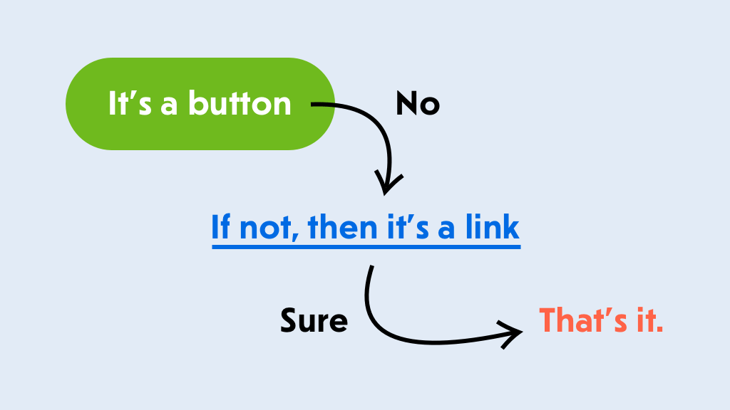
In general though, there is still quite a bit of confusion which element to use for user interaction: when do we use links, and when do we use buttons? Marcy Sutton has written a detailed piece on Links vs. Buttons in Modern Applications. With a link, the visitor navigates to a new resource, taking them away from the current context. But a button prompts a change in the interface.
Marcy outlines use cases for both links and buttons in single-page applications, showing that a button is a perfect element for opening a modal window, triggering a pop-up, toggling an interface or playing media content. You can also check Vadim Makeev’s article on “When Is A Button Not A Button?”.
It has become quite common for lengthy web forms to keep the “Continue” button disabled until the customer has provided all data correctly. This behavior acts as an indicator that something is wrong with the form, and it can’t be completed without reviewing the input. This works if the inline validation for every input field is working well, and it doesn’t work at all when it’s glitchy or buggy.
In “Disabled Buttons
Weekly tips on front-end & UX.Trusted by 182,000+ folks.
Meet Smashing Workshops on front-end, design & UX, with practical takeaways, live sessions, video recordings and a friendly Q&A. With Brad Frost, Stéph Walter and so many others.
Below you’ll find an alphabetical list of all accessible components. Skip the table of contents, or just scroll down to explore them one-by-one.
Every browser has default focus styles, yet out of the box, they aren’t very accessible. The goal of :focus is to give the user guidance on where exactly they are in the document and help them navigate through it. To achieve that, we need to avoid a focus that’s too subtle or not visible at all. In fact, removing outline is a bad idea as it removes any visible indication of focus for keyboard users. The more obvious the focus is, the better.
There are ways of designing better :focus styles. In her article Tips For Focus Styles, Nic Chan highlights a few helpful tips on how to improve focus styles with better affordance and a bit of padding, offset, and proper outlines. Sara Soueidan also published a helpful reference guide to designing accessible, WCAG-compliant focus indicators. The guide is aimed at both designers who want to learn about accessibility considerations, as well as developers who want to implement them. Need more fun with :focus styles? Lari Maza has got your back, too.
We can also use :focus-within to style the parent element of a focused element, and :focus-visible to not show focus styles when interacting with a mouse/pointer if it causes any issues in your design.
It’s important co consider the accessibility concerns around :focus-visible: as Hidde de Vries has noted, not all people who rely on focus styles use a keyboard and making focus styles keyboard-only takes away an affordance for mouse users too, as focus also indicates that something is interactive (thanks to Jason Webb for the tip!).
Finally, it’s worth noting that most recently Chrome, Edge, and other Chromium-based browsers stopped displaying a focus indicator (focus ring) when the user clicks or taps a button (thanks to Kim Johannesen for the tip!).
Every time you have to deal with a larger data set, be it a map, a data visualization, or just a country selector in checkout, autocomplete can boost customer’s input massively. But just as it helps with the input, it needs to help with announcing the options and the selection to the screen reader users as well.
Gov.uk, the team behind the Government Digital Service in UK, has open-sourced accessible-autocomplete (among many other things), a JavaScript component that follows WAI-ARIA best practices. You can choose when to start displaying suggestions, and allows to display the menu as an absolutely positioned overlay, or select the first suggestion by default. The team also provides a demo page, with a dozen of accessible autocomplete examples and implementations.
The team at Adobe also created an accessible autocomplete experience for the React implementation of their Spectrum design system. Daniel Lu shares some valuable insights into the component and the problems it solves.
It’s not uncommon to have a link or button that visually has no text but consists only of an icon — a compact navbar, for example, or social icons. But how do you make sure that these kinds of icon links are fully accessible? As it turns out, it’s not as straightforward as one might think.
To show how we can do better, Kitty Giraudel dedicated an article “Accessible Icon Links” to the issue. They use an icon link consisting of an SVG with the iconic Twitter bird to illustrate the point, and shows step by step how to make it accessible: with a descriptive text that is visually hidden, then removing the SVG markup from the accessibility tree with aria-hidden, and, finally, correcting the fact that svg elements can be focused on Internet Explorer by adding the focusable attribute. At the end of the article, Kitty also shows how to turn all of this into a little React component.
A small detail that will make a huge difference for a lot of users.
In Creating Accessible Icon Buttons and Inclusively Hidden, Sara Soueidan and Scott O’Hara go into all the fine intricacies and details of icon buttons, exploring a number of techniques to make it work. Sara and Scott explore a number techniques, suggesting to use an appropriate technique for accessible visually hidden text — the text that will be visually hidden but accessible to screen readers. This could be done with a .sr-only utility class, or hidden and aria-labelledby, or aria-label alone. Sara wouldn’t recommend to use the SVG icon itself to provide a label for the button when I can provide one on the button itself directly.
In general though, there is still quite a bit of confusion which element to use for user interaction: when do we use links, and when do we use buttons? Marcy Sutton has written a detailed piece on Links vs. Buttons in Modern Applications. With a link, the visitor navigates to a new resource, taking them away from the current context. But a button prompts a change in the interface.
Marcy outlines use cases for both links and buttons in single-page applications, showing that a button is a perfect element for opening a modal window, triggering a pop-up, toggling an interface or playing media content. You can also check Vadim Makeev’s article on “When Is A Button Not A Button?”.
It has become quite common for lengthy web forms to keep the “Continue” button disabled until the customer has provided all data correctly. This behavior acts as an indicator that something is wrong with the form, and it can’t be completed without reviewing the input. This works if the inline validation for every input field is working well, and it doesn’t work at all when it’s glitchy or buggy.
In “Disabled Buttons
本页为82搜索生成的网页快照,内容来自站内索引;演示数据的原文链接仅作示例。